Simple Supple Foods
–
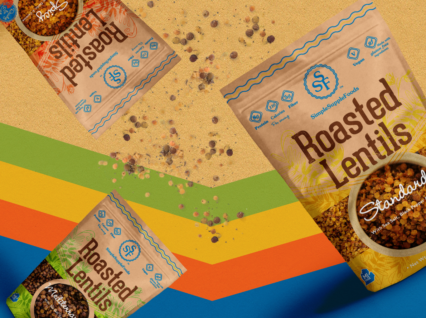
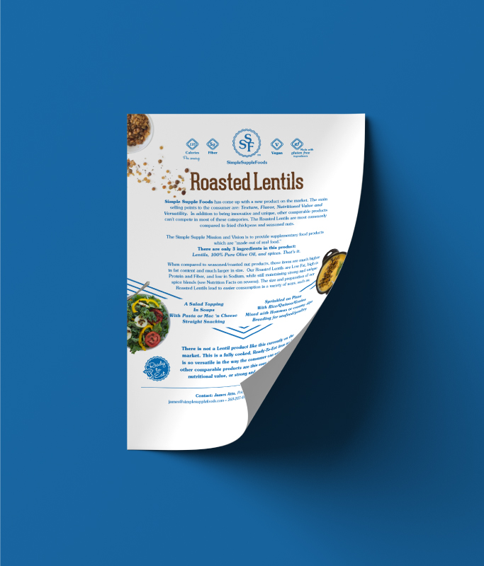
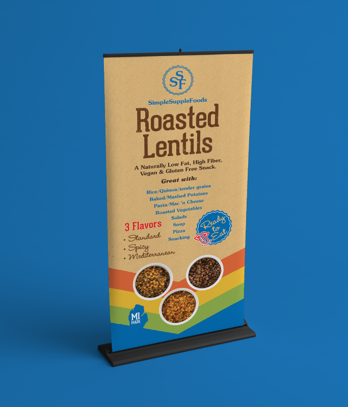
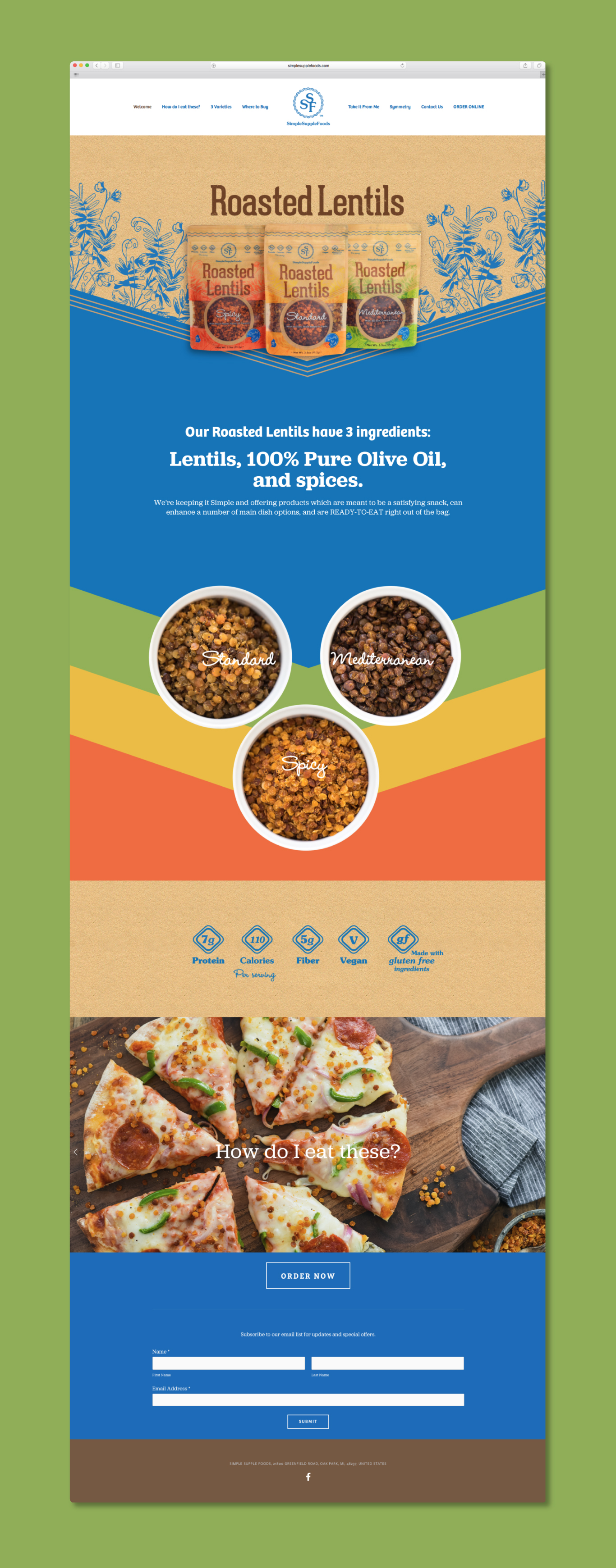
Simple Supple[mental] Foods believes that all food should only be made of actual foods, and that healthful snacks can be fun and flavorful too. Building on early success, SSF approached Who’s That? in hopes of moving beyond the farmer’s market, to claim a unique place in the greater mass market and craft a distinctive look for their signature Roasted Lentils, both online and in print.
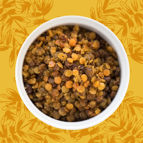
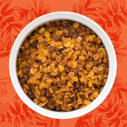
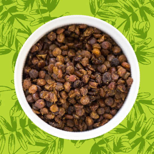
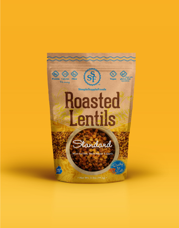
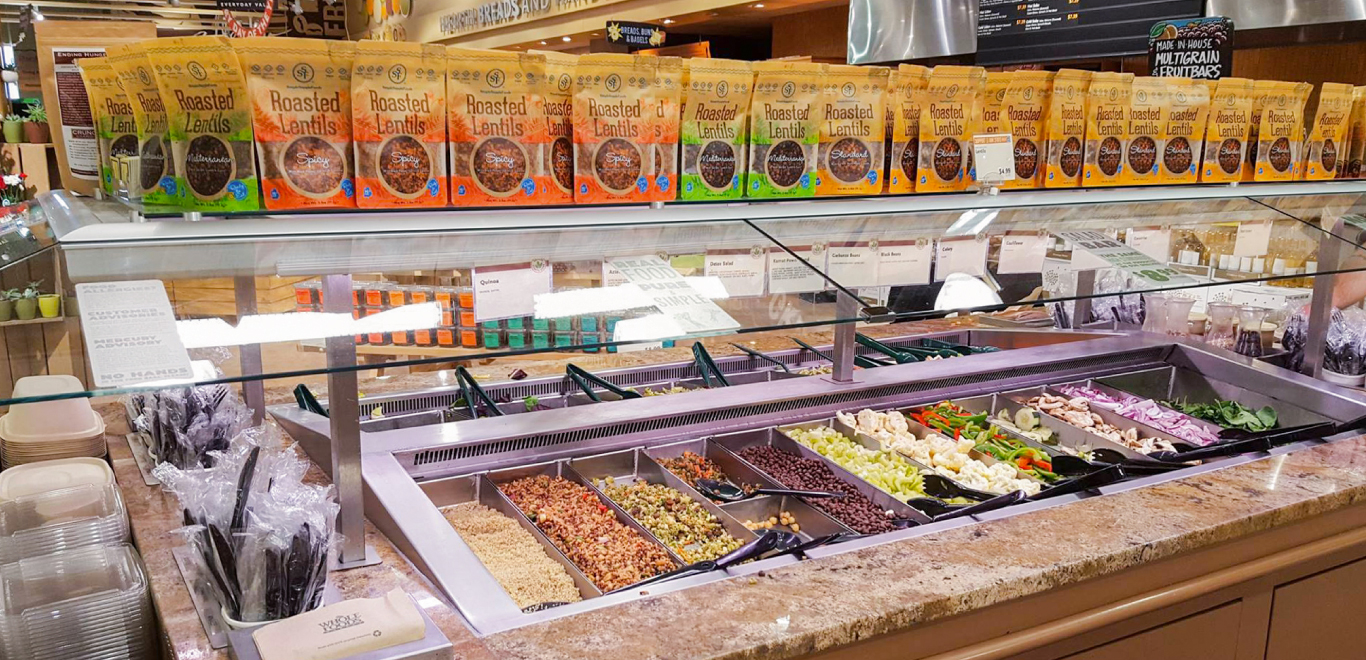
We began with an existing palette of warm Mediterranean hues of orange, gold, and green, based on their three flavor varieties, Spicy, Standard and Mediterranean. At the top, we crafted a new mark for SSF, keeping things fun and simple with a triple letter monogram and scalloped-edge seal. Once we established the brandmark, we turned to the packaging, completely reinventing the zipper pouches from top to bottom. Bold colorful chevrons map to the flavorful product profiles, while whimsical lentil flower illustrations and kraft backdrop balance the design and evoke the natural and handmade qualities of the Roasted Lentils. The shelf appeal was completed with vibrant food photography featured on the front and back of each package. Together, the new look was successful in garnering SSF Roasted Lentils entry into Whole Foods Markets on the very day the new pouches debuted.
simplesupplefoods.com
Sector
Food, Retail
Tags
Branding/Identity, Art Direction, Web, Print, Special Project
